John Stuart Mill was among the foremost liberal thinkers of modern times who wrote extensively…
How Unequal are World Incomes? C. P. Chandrasekhar and Jayati Ghosh
In discussions of global inequality, there is general agreement that, whatever else may have happened, within-country inequality has increased in most cases, even as between-country inequality has come down. But overall, because of the recent emergence of countries with large populations like China and India, there has actually been some reduction in global inequality, because of increasing incomes in the “middle” of the global distribution. Chart 1 shows that, whether measured by the Gini coefficient (a measure of the dispersion of incomes of the population) or the Palma ratio (the ratio of the share of income of the top ten per cent of the population to the bottom 40 per cent), inequality has declined especially since the turn of the century.
Chart 1: Global income inequality appears to have come down
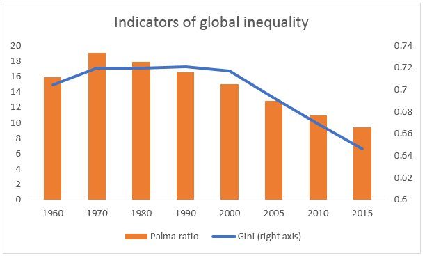
Source: World Inequality Report 2018.
This is what gave rise to the famous “elephant curve” first described by the economist Branko Milanovic, which described percentage changes in income across different deciles of the global population. This showed a strong percentage growth in the middle of the global income distribution (the back of the elephant), much lower growth in the second decile, and a higher growth in the top decile (the trunk of the elephant).
But there are two important caveats to this. First, the “elephant curve” is based on proportionate increases in per capita incomes of each percentile – and obviously, the proportionate increase will be greater the lower the initial income. If incomes are lower to start with, a higher proportionate increase may amount to much less increase in absolute terms. For example, a 20 percentage point increase of a per capita income of $1000 (approximately the fifth decile, or the middle) would generate an additional $200, but that would be only 1 percentage point increase of a per capita income of $20,000.
So it is worth looking at absolute changes in income, to see how the income gaps have really moved. When absolute changes are considered, the middle hump of the elephant disappears: the graph looks more like a hockey stick, with very little increase except for the top groups, which show very sharp increases.
A second important concern is that these incomes are anyway are estimated in terms of Purchasing Power Parity (PPP) exchange rates rather than market exchange rates (MER). There are many reasons to believe that PPP measures overstate the incomes of people in poor countries, thereby underestimating global inequality. What is, the difference between PPP and has increased significantly over the past decades. The difference between the top ten per cent and bottom fifty per cent of the population was around 5 percentage points more in MER terms than in PPP terms in 1980. But by 2015, the difference between the two estimates had doubled to ten percentage points – which means that that the PPP measures increasingly underestimated global inequality over this period. In fact, the extent of international inequality is likely to be substantially more than is indicated by measures based on PPP exchange rates.
All this suggests that getting a real sense of the changed composition of global GDP and of the growing importance of emerging economies should be based on market exchange rates. This certainly makes sense when it comes to issues of global economic power, since all international transactions still take place at those market exchange rates. Chart 2 provides a look at the evolution of shares of global GDP of the major geographical regions, measured at market exchange rates in current US dollars, from 1968 onwards.
The results are quite startling, at least for those who may have fallen for the hype surrounding emerging markets. The apparent decline in the share of North America has been quite gradual, over a volatile trajectory, and more marked only after 2005, while for the European Union, the decline in share was really evident only from 2009 onwards. But for other regions, the overall absence of convergence is striking. Since the late 1960s, the only region to show notable increases in share of global GDP was East Asia and the Pacific. All the other regions, covering most of the developing world, showed little or no increase in shares of global GDP over this entire period. Given that population growth rates were typically higher in these regions than in North America and Western Europe, the differences in per capita income would have been even greater.
Even the greater dynamism of East Asia was largely due to only two countries: first Japan until the late 1980s, and then China in the current century. Chart 3 highlights the role of China, whose share increased from less than 3 per cent in 1968 to nearly 15 per cent in 2016, with most of that increase occurring only after 2002.
Chart 2: Only East Asia shows a significant increase in global GDP share
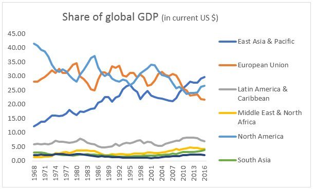
Source: World Bank World Development Indicators online.
Chart 3: China has been responsible for the increase in the Asian share of global GDP
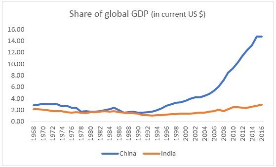
Source: World Bank World Development Indicators online.
Furthermore, even in the more dynamic regions, in general the bulk of the people did not benefit from the increasing incomes. Table 1 shows the share of income increases in the period 1980 to 2016 going to different segments of the population in major countries as well as in the world as a whole. Once again, it was only in China that the middle 40 per cent of the population (below the top decile) garnered slightly more than 40 per cent of the income increase, roughly similar to the gains taken by the top 10 per cent. In all other regions, the top decile clearly got away with the lion’s share of income growth. Russia’s trajectory bordered on the obscene, with the top decile getting more income increases than the country as a whole, at the cost of the bottom half whose incomes declined absolutely. But India’s experience was also stark: the top 10 per cent got two-third of income increases, and just the top 1 per cent got 28 per cent – suggesting changes in inequality equivalent to those in North America.
Share of income growth, 1980-2016
| China | Europe | India | Russia | US-Canada | World | |
| Bottom 50% | 13 | 14 | 11 | -24 | 2 | 12 |
| Middle 40% | 43 | 38 | 23 | 7 | 32 | 31 |
| Top 10% | 43 | 48 | 66 | 117 | 67 | 57 |
| Top 1% | 15 | 18 | 28 | 69 | 35 | 27 |
Source: World Inequality Report 2018
So the much-vaunted global income convergence seems much more like a coming together of elites in rich and emerging market economies, excluding out the bulk of the population everywhere.
(This article was originally posted in the Business Line on 27 March 2018.)